

Two numbers, both true, both describing deaths from coronary heart disease in 2020. In Germany the rate was 176 per 100,000 people. In The Gambia it was 42. Heart disease, then, is something like four times the problem in Germany that it is in The Gambia.
Except that Germany is full of older people and The Gambia is not, and heart disease is overwhelmingly a disease of later life. Put both countries on the same age profile, which is a standard adjustment called age standardisation, and the two numbers change places. Germany falls to 56. The Gambia climbs to 143.
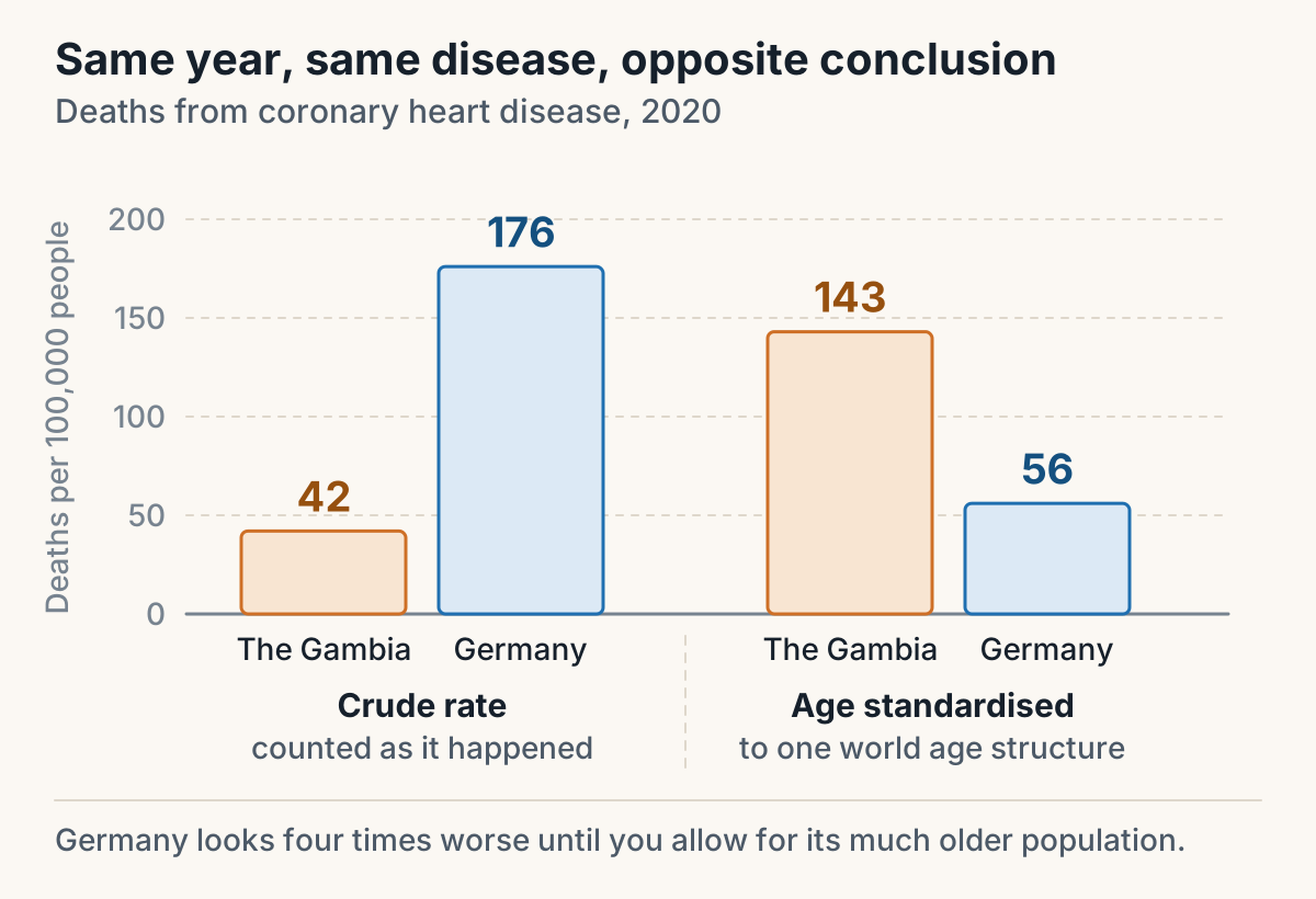
Those figures are WHO 2020 data. Nobody lied, and all four numbers are correct. The chart simply answered a different question from the one the reader asked it, and that is what goes wrong with health graphs almost every time. The data is rarely fake. The reader asks one question and the axis is quietly answering another.
Here is where it happens, in roughly the order the mistakes get made.
A count is not a rate
A count is how many people. A rate has a denominator underneath it, and usually a stretch of time as well, so it arrives as something per 100,000 per year. They are different quantities, and in the same country over the same years they can move in opposite directions without either of them being wrong.
New Zealand's population is growing and ageing at once. For any disease that becomes more likely with age, those two facts on their own push the number of cases up year after year, even when nobody's individual risk has shifted at all.
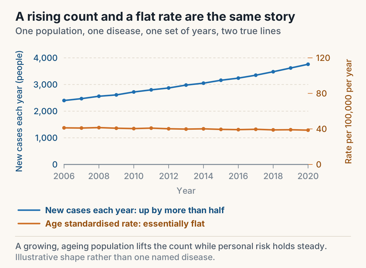
So a headline about a record number of cases is often telling you about the size and the age of the population rather than about the disease. The question to ask is whether the number has a denominator. If it does not, it is a count, and a rising count is close to the least surprising thing in public health.
The same check is worth a free mark in an exam. An option that gives a count a rate's units, along the lines of saying the number of registrations in 2016 was 2,800 per 100,000, is wrong before you have looked at the chart at all. Registrations are counted in people.
Two axes means two different quantities
When a chart carries a second vertical axis on the right, it is usually showing you exactly that pairing, one quantity that is counted and one that has a denominator. The commonest way to misread it is mechanical rather than conceptual. You find the year along the bottom, go up to the line, then go left to the axis out of habit, when the line you are reading belongs to the axis on the right.
Make it three deliberate steps instead. Find the year. Identify the line in the legend by its colour. Then read across to the axis that line belongs to, and say the units to yourself as you take the value off.
The gap between two lines says more than either line
One of the most useful charts in health shows new cases of a disease and deaths from it, over the same years, in the same population. Almost nobody reads it properly, because the eye goes to whichever line is moving and the meaning is in the distance between them.
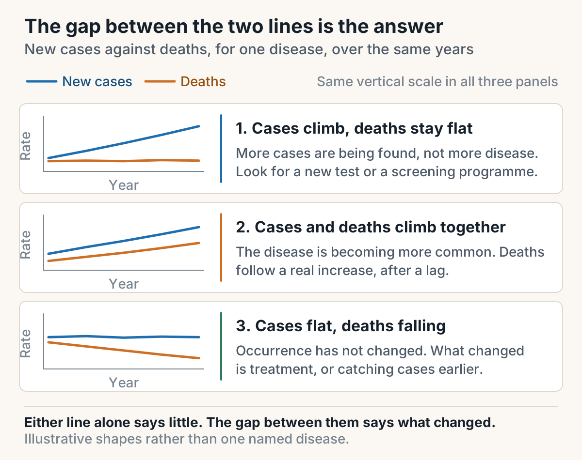
The first shape is the one behind a good deal of cancer news. When new cases climb steeply and deaths stay level, something is finding more cases without more people dying of them. A genuine rise in a serious disease drags mortality along behind it after a lag. A rise with flat mortality is the fingerprint of detection, which means a new test, a screening programme, more awareness, or easier access to a diagnosis. The cases being added are ones that were missed before, or ones that were never going to kill anybody.
That is not an argument against screening. It is an argument for knowing which of the two things you are looking at before you decide a disease is getting worse.
Read who the chart leaves out
Titles carry restrictions, and the restrictions are load-bearing. A chart of melanoma rates in the non-Māori population of New Zealand is a chart about the people it names and nobody else. Any explanation that reaches for what is happening to Māori is reasoning about people who are not in the figure.
The same move gets made with sex, with age bands, and with the years on the bottom axis. An explanation that leans on something that happened in 2003 is dead if the line stops in 1998. This is the cheapest correction available in any argument about a chart, because it needs no knowledge whatsoever. It needs you to read the title and the span of the horizontal axis before you read anything else.
Age standardised is a claim, and it rules things out
Back to the two countries. Standardising is worth doing in one situation only, which is when two populations have different age structures and the risk of the disease varies by age. Both of those have to be true. If either one fails, the adjustment buys you nothing.
Where it does apply, it can reverse a comparison outright, as it did there. It also kills two explanations on sight. Population growth cannot explain a trend in a standardised rate, because a rate has a denominator that grows along with the population. An ageing population cannot explain it either, because stripping out the effect of a changing age structure is precisely what standardising does. Both are perfectly good explanations for a rising count, and both are dead for a standardised rate, which is why they turn up so often as the wrong answer.
The order to do it in
- Read the title first. Note the disease, the population, the years, and whether you are looking at a count or a rate.
- Read both axes next. Take the units off each one and work out which line sits on which.
- Check units before values. Any claim whose units do not match the quantity it is describing can go immediately, with no arithmetic at all.
- Ask what the explanation would actually move. If it changes the number of people but not the risk to a person of a given age, it explains a count and it does not explain a standardised rate.
Do that with a handful of real charts and it stops being four steps and becomes one look, which is the point. Most people who get fooled by a health graph are not bad at maths. They read the line before they read the label.
If you are doing this for POPH192, figure questions are worth practising on their own, and the rest of the run-up is in how to study for Progress Test 2. The step that comes before any calculation is in before you do the maths, work out what kind of study it is.
There are worked POPH192 figure questions on Cutline if you want the repetitions.